

Fancy text explained: how copy-and-paste Unicode fonts really work
Fancy text isn't a font: it's a set of different Unicode characters that look like regular letters, such as 𝐀 (mathematical bold) or Ⓐ (circled letter). That's why it survives copy and paste almost anywhere, and also why it sometimes shows up as boxes, doesn't show up in searches and sounds odd to screen readers.
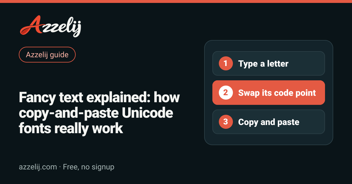
You've probably seen Instagram bios in 𝐛𝐨𝐥𝐝, game names in 𝔤𝔬𝔱𝔥𝔦𝔠 or messages with c̶r̶o̶s̶s̶e̶d̶ o̶u̶t̶ words. People call it "fancy text", "copy and paste fonts" or "Unicode fonts", and here at Azzelij we generate it every day in text styles. This guide is the full explanation: what actually happens when you convert your text, where each style comes from, why it sometimes breaks and how to use it without turning your profile into something nobody can read.
You don't need to know how to code to follow along. The key idea fits in one sentence: a fancy text generator doesn't change the font, it changes the characters. Everything else, good and bad, follows from that.
What fancy text is (and what it isn't)
Unicode is the standard that gives a number to every character used in digital writing: letters from almost every alphabet, digits, punctuation, emoji, math symbols and much more. That number is called a code point and is written as U+ followed by a hexadecimal value. The everyday capital A, for example, is U+0041.
The interesting part is that Unicode includes many characters that look almost exactly like our letters but are different characters. The 𝐀 you see in "copyable" bold text isn't an A with formatting: it's U+1D400, officially named MATHEMATICAL BOLD CAPITAL A. It exists so mathematicians can tell bold variables from regular ones in plain text. Fancy text generators borrow those characters and use them as a decorative alphabet.
Font versus character: the difference that explains everything
A font (or typeface) is the drawing your device uses to display a character. When you make something bold in a word processor or switch to another typeface, the text stays exactly the same; only the way it's painted changes. That formatting lives in the document or app, and it's lost as soon as you paste the text into a field that only accepts plain text, like many social bios or profile names.
Unicode letters work the other way around: the style is part of the text itself, because every letter is a different character. That's why you can paste 𝓗𝓮𝓵𝓵𝓸 into a field with no formatting options and it still looks styled. The flip side is that, to a computer, 𝓗𝓮𝓵𝓵𝓸 is no longer the word "Hello": it's five different symbols that only look like it to your eyes.
- AYou typeYou enter a regular letter. In Unicode that's U+0041, the plain Latin A.
- →Its twin is foundThe generator looks up the matching character in another block, such as mathematical bold U+1D400.
- 𝐀The character changesYour text now holds a different symbol. No formatting, just another character that looks similar.
- ⧉You copy and pasteThe clipboard carries the code point, not a font. That's why the style travels with you.
- AaThe app looks for a glyphYour device checks whether any of its fonts has a drawing for that character.
- □It shows… or notIf a glyph is found, you see the style. If not, you get an empty box or a question mark.
Where the styles come from: Unicode blocks
Unicode organizes characters into blocks, which are ranges of code points grouped by theme. Nearly every style in a fancy text generator comes from a handful of blocks, and knowing them helps you predict how well each one will behave.
Mathematical Alphanumeric Symbols (U+1D400–U+1D7FF)
This block is the gold mine of fancy text. It contains full alphabets in bold, italic, bold italic, script, fraktur, double-struck, several sans-serif variants and monospace, plus digits in some of those styles. It's the source of bold text, italic text, script text, gothic text and monospace text, among others.
One important detail: the block only covers the basic letters A to Z, some Greek letters and digits. There are no mathematical versions of accented letters, ñ or ü. Convert the Spanish word "Año" to bold and you get 𝐀ñ𝐨: the ñ stays plain. If you write names or words with diacritics, check the result before you paste it.
Gaps in the block and borrowed letters
When this block was created, some styled letters already existed elsewhere in Unicode, in the Letterlike Symbols block (U+2100–U+214F). To avoid duplicates, Unicode left gaps in the math block. The italic h, for example, isn't where you'd expect it: generators use ℎ (U+210E, the Planck constant symbol). In fraktur, the capital C is ℭ (U+212D) and the capital H is ℌ (U+210C). Double-struck has the same story with ℂ, ℍ, ℕ, ℙ, ℚ, ℝ and ℤ.
A good generator fills those gaps with the right borrowed letter, which is why "Chihuahua" in gothic comes out as ℭ𝔥𝔦𝔥𝔲𝔞𝔥𝔲𝔞. A sloppy one leaves an empty character or a random symbol in the middle of the word. Since the borrowed letters come from a different block, some fonts draw them with slightly different weight or size, and you may notice a small visual jump in the word.
Circled and squared letters
Bubble text like Ⓗⓔⓛⓛⓞ comes from the Enclosed Alphanumerics block (U+2460–U+24FF), which has circled capitals, lowercase letters and numbers. Square text like 🄷🄴🄻🄻🄾 or 🅷🅴🅻🅻🅾 comes from the Enclosed Alphanumeric Supplement (U+1F100–U+1F1FF), which only has capitals. Several of those squared characters also have an emoji presentation on some systems, so they may appear in color, larger or in a different style depending on the phone.
Wide or fullwidth letters
Wide text such as Hello comes from the Halfwidth and Fullwidth Forms block (U+FF00–U+FFEF). These characters exist so Latin letters can take up the same space as a Chinese, Japanese or Korean character when they're mixed in the same line. That's why they look spaced out and stretched, the classic vaporwave look. The fullwidth A is U+FF21, exactly 0xFEE0 positions after the regular A.
Small caps: incomplete coverage
Small caps text like ʜᴇʟʟᴏ ꜰʀɪᴇɴᴅs is a special case. Unicode doesn't have a complete, ordered small caps alphabet; what exists are scattered letters from the IPA Extensions and Phonetic Extensions blocks, designed for phonetic transcription. Some letters have no small cap version, or one so recent that few fonts draw it. That's why our generator leaves s and x as they are and uses ǫ for q. It's a lovely style, but it's not perfect.
Strikethrough, underline and other combining mark effects
Not every style replaces letters. Unicode has combining marks: characters that don't display on their own but attach above, below or through the previous character. Accents can be written this way, and so can several decorative effects.
Strikethrough text adds U+0336 (combining long stroke overlay) after each letter: n̶o̶t̶ t̶o̶d̶a̶y̶. Underlined text uses U+0332 (combining low line): i̲m̲p̲o̲r̲t̲a̲n̲t̲. Because the base letter stays the regular one, these effects work with accented letters too, unlike the math alphabets: c̶a̶f̶é̶.
The catch is that the result depends heavily on the font. In some apps the strikethrough line looks perfect; in others it breaks between letters, sits a little off or looks thicker than usual. Underlines may show gaps. Nothing breaks, but it's worth checking how it looks where you plan to use it.
Combining mark effects
Upside-down text: a look-alike trick
Upside-down text doesn't rotate anything. The generator reverses the order of your text and swaps each letter for another character that resembles it flipped: a becomes ɐ (from the phonetic alphabet), A becomes ∀ (the math "for all" symbol) and e becomes ǝ. So "Hello world" turns into pןɹoʍ oןןǝH. Some letters don't have a perfect match, so certain words read better than others.
Zalgo and stacking too many marks
If one combining mark can decorate a letter, nothing stops you from stacking ten or twenty. That's the famous zalgo text, the glitchy look that spills above and below the line. It's eye-catching, but it has real costs: it can cover the lines above and below in a chat, some platforms trim it or strip the extra marks, and for a screen reader it's pure noise. If you use it, keep it small and never use it for something people need to read.
Fancy text style comparison table
Here are the most popular styles, the block each one comes from and what to watch for. The examples are produced by the same converter the site uses.
| Style | Unicode block | Example | Caveat |
|---|---|---|---|
| Bold | Mathematical Alphanumeric Symbols | 𝐇𝐞𝐥𝐥𝐨 | No accents or ñ; each letter counts as 2 units |
| Italic | Math Alphanumerics + Letterlike | 𝐻𝑒𝑙𝑙𝑜 | The h comes from another block (ℎ) |
| Script | Math Alphanumerics + Letterlike | ℋℯ𝓁𝓁ℴ | Several borrowed letters may look heavier or lighter |
| Gothic (fraktur) | Math Alphanumerics + Letterlike | ℌ𝔢𝔩𝔩𝔬 | ℭ, ℌ, ℑ, ℜ and ℨ come from another block |
| Double-struck | Math Alphanumerics + Letterlike | ℍ𝕖𝕝𝕝𝕠 | ℂ, ℍ, ℕ, ℙ, ℚ, ℝ and ℤ are borrowed |
| Monospace | Mathematical Alphanumeric Symbols | 𝙷𝚎𝚕𝚕𝚘 | Looks like code but doesn't behave like code |
| Bubble | Enclosed Alphanumerics | Ⓗⓔⓛⓛⓞ | Some fonts draw them quite small |
| Square | Enclosed Alphanumeric Supplement | 🅷🅴🅻🅻🅾 | Capitals only; sometimes shown as emoji |
| Wide | Halfwidth and Fullwidth Forms | Hello | Takes a lot of horizontal space |
| Small caps | IPA and Phonetic Extensions | ʜᴇʟʟᴏ | Partial coverage: s and x stay plain |
| Strikethrough | Combining Diacritical Marks (U+0336) | H̶e̶l̶l̶o̶ | The line may look broken |
| Underline | Combining Diacritical Marks (U+0332) | H̲e̲l̲l̲o̲ | Doubles the character count |
| Upside down | Look-alikes from several blocks | oןןǝH | Visual trick; some letters aren't exact |
| Regional indicators | Regional Indicator Symbols | 🇭🇴🇱🇦 | Two letters in a row may become a flag (LA = Laos) |
Fancy text styles to copy
Why fancy text sometimes shows up as boxes
That empty box (designers call it "tofu") appears when your device receives a character that none of its fonts can draw. The character is there, complete and correct; there's just no glyph to display it. Copy the same text to a phone with newer fonts and it may look perfect.
Missing glyphs and older systems
Recent operating systems usually ship fonts with good coverage of the math and enclosed alphanumeric blocks. Older phones, some smart TVs, consoles, smartwatches or older desktop programs may not. Characters added to Unicode recently fail most often, because fonts take time to catch up. That's why a style can look fine on your phone and show boxes on your friend's.
App and game filters
The other reason is that some platforms filter characters on purpose. Many games limit names to certain alphabets to prevent impersonation or names that can't be reported; some forms reject anything that isn't a common letter; and certain fields strip combining marks. When that happens, the style can disappear, turn into question marks or get the name rejected. There's no way to know without testing, and the rules change with updates.
Why fancy letters count double: UTF-16 and character limits
Many apps measure text length in UTF-16 units, an encoding where each character takes one or two units. Characters with a code point below U+10000 use one unit; those above it, like the whole math block, need two (a "surrogate pair"). The result: "Hello" measures 5 units, but 𝐇𝐞𝐥𝐥𝐨 measures 10.
Combining marks add up too. H̶e̶l̶l̶o̶ measures 10 units, because every letter carries its own stroke. On the other hand, wide letters like Hello and bubble letters like Ⓗⓔⓛⓛⓞ sit below U+10000 and measure 5, the same as plain text. In UTF-8, which is how most of the web stores text, each math letter takes 4 bytes versus 1 byte for a plain letter.
That's why a 12-letter name sometimes "doesn't fit" in a 16-character field. If that happens, measure your text with the character counter, which shows visible characters and units, and decide whether to style just part of the name.
Search and accessibility: the part nobody mentions
Styled text isn't searchable as normal text
Because 𝐀𝐳𝐳𝐞𝐥𝐢𝐣 is made of different characters than "Azzelij", many in-app search boxes won't find it when someone types the plain word. If your username or business name is entirely in Unicode letters, people may not find you when they search for you. Some systems apply a normalization called NFKC that maps many of these letters back to their basic form, but not all of them do, and it doesn't work for every style: upside-down text, for instance, never reads as the original word again.
The same goes for machine translation, spell checkers and the find-in-page feature: to them, a word in gothic letters is a string of math symbols. Ideally, the keywords in your profile (your real name, what you do, your city) should stay in plain text.
How screen readers handle it
Blind and low-vision people use screen readers that read text out loud. With math letters, the result depends on the reader and the system: some read each symbol by its name (something like "mathematical bold capital A"), others skip them and others announce single letters without forming the word. Either way, a full sentence in Unicode letters becomes very hard to listen to. Emoji and decorative symbols are also read one by one, with their full names.
Where fancy text usually works and where to test first
There's no official list of where each style works, and apps change their rules without notice. What we can share is the general pattern that tends to hold and what to check in each case.
- Bios and profile descriptions: they usually accept almost every style, and it's where fancy text is used most. For platform-specific ideas, see Instagram fonts and Discord fonts.
- Messages and chats: up-to-date apps usually render them fine, but the person receiving your message might have an older phone and see boxes.
- Display names and usernames: more filters here. Many usernames only accept basic letters, numbers and underscores; display names tend to be more flexible.
- Game names: this is where it varies the most. Some games accept symbols and Unicode letters, others block them or replace them with odd marks. Test first, and check our gamer name generator for ideas that work with or without styling.
- Emails, forms, official documents and search fields: better to avoid them. They can break validation, trip spam filters or simply look unprofessional.
If you want the details per network, our guide to fancy fonts for social media covers which style fits each part of a profile. And if games are your thing, how to create an original gamer name explains how to balance style and readability in a username.
Best practices for using fancy text well
After all of the above, these are the rules we follow and recommend:
- Style sparingly: one word or a short name looks better than a full paragraph, and it stays easy to read.
- Keep important information in plain text: contact details, prices, dates, links and instructions.
- Check accented letters: math styles leave them unconverted, so you may want another word or a combining mark style instead.
- Measure before pasting: math block styles double the length in many counters.
- Prefer decorations around the text: a frame made with symbols and decorations like ꧁Azzelij꧂ or ♕【Azzelij】♕ keeps the name itself in plain, readable letters.
- Test in the real place: paste the text into the app where you'll use it and, if you can, check it on another device.
- Keep a clean version handy: if something goes wrong, go back to plain text and try another style.
Decorated names that stay readable
How to get back to plain text
If someone sent you text full of strange letters, or you pasted something that doesn't display well, use clean Unicode text. It converts math, wide and circled letters back to their basic form and removes effect marks like strikethrough or underline. Upside-down text and small caps can't always be recovered, because they're look-alikes rather than equivalents. And speaking of Unicode tricks: the invisible character is another Unicode trick, a character that takes up space but can't be seen. It's handy for some names or blank messages, although certain platforms filter it too.
Tools in this guide
- Fancy text styles to copy and pasteCompare fancy text styles with your own words
- Bold text generator for copy and pasteTry bold Unicode text with your own words
- Gothic text generator for names and profilesTry Gothic Unicode text with your own words
- Strikethrough text generator to copyTry strikethrough text with your own words
- Character and word counterPaste your text and see how long it is
- Unicode text normalizer and fancy text removerTurn decorative Unicode into simpler text
Frequently asked questions
Is fancy text a font?
No. Fancy text uses different Unicode characters that look like regular letters, such as mathematical bold U+1D400. That's why it can be pasted into places without formatting options, unlike a font.
Why does fancy text show up as boxes?
Because the device displaying it has no font with a drawing for those characters, or because the app filters them. The text is fine; the glyph is missing. Up-to-date systems usually do better, but it's worth testing.
Why don't accented letters convert?
The Mathematical Alphanumeric Symbols block only includes A to Z, some digits and Greek letters. There are no accented letters or ñ in math bold or fraktur, so they stay plain. Combining mark styles like strikethrough do work with them.
Does Unicode text affect how people find my profile?
It can. Many apps don't treat styled letters as the regular word, so someone typing your name might not find you. Keep your name and keywords in plain text.
Is fancy text accessible to screen readers?
Not really. Depending on the reader, it may be read as math symbol names, letter by letter or skipped entirely. Use it only as decoration and never for essential information.
Why doesn't my fancy name fit the character limit?
Many platforms count UTF-16 units, and math block letters take two units each. Combining marks add to the count too. Measure your text with a counter before pasting it.
 Symbols for names and nicknames: how to decorate without the mess
 How to make a signature you can repeat the same way every time
 Zodiac compatibility: how it works and the most compatible signs